To celebrate our 10th birthday Loquax has had a much needed makeover. Out go the yellow tabs, the small duck logo and dark blue sidebars and in comes a much bigger Loquax logo, a gradient style background and a cleaner fresher overall look. We hope you like our nice new look!
Old Loquax Logos
We've managed to find some of our older logos and as a birthday treat are going to share them with you.....
The Early Years!

This was an early Loquax banner, when we downplayed the name in favour of the slightly less memorable Win Win Win WWW Competitions. Eventually we saw the error of our ways and decided we'd be better off being known as Loquax. Whilst our marketing skills improved, our skills in graphic design didn't follow!
3D Loquax

Our first real effort at creating a logo saw us go for a 3D effect. It was probably designed using a free graphics design program that came free with a computer magazine. 3D effect logos were all the rage once - yes really. The logo was the first time we opted for a dark red colour, something which has actually stuck with us throughout the years.
'Juventus' Loquax

The 3D logo was replaced with what we thought was a slightly better design, although it does look like Tamoil's logo who used to sponsor
Juventus! Again the red features but the blue just wasn't the right colour for us.
Loquax and the Duck

The most recognisable Loquax logo and the first to feature a duck! We decided to add the duck into the logo to emphasis that we are Lo-quacks and not some posh Lo-quah. Unfortunately we don't recall who came up with the duck design although looking at it now it does seem a little cross-eyed.
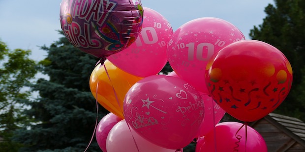
10 Years Of Comping
And now we have the Super-sized Loquax logo to take us on into another year of competitions and community! We'd like to say that it has been an absolute pleasure running Loquax over the last 10 years, and without the support of our users we couldn't have gotten this far. Neither of us could ever have envisaged that Loquax would reach 10 years old and be regarded as the UK's top competition site. So we'd like to thank you everyone who has visited us and been part of Loquax over the last 10 years! Thank you... and Happy Birthday Loquax!
Happy 10th Birthday Loquax! Discussion
We're keen to hear your views on Happy 10th Birthday Loquax!. Join in the conversation below and share your experiences. You'll need to be registered with Loquax AND have made an initial hello post here to comment. Please note that comments may be moderated and may not always reflect the views of Loquax Ltd.